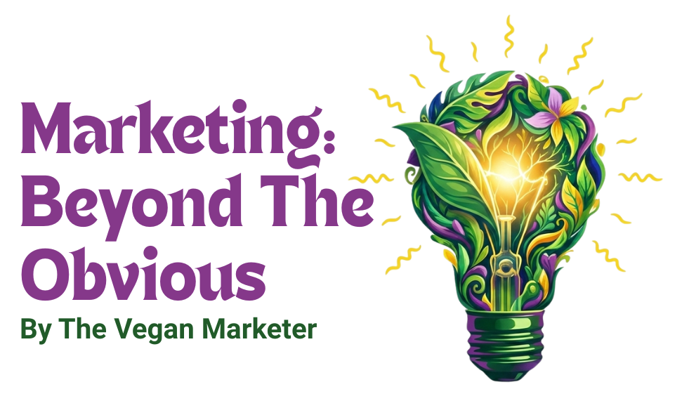
So….this happened….
When I launched “The Vegan Marketer” at the end of November 2022, I was relatively new to the space. (You can read my story of how I chose this space here.)
Flashback
To design my logo, I did exhaustive visual research of vegan brands, with a special focus on service based businesses. I studied:
- The visual elements used
- Color codes
- Fonts
My brief for the logo and brand identity was that it had to be:
- Simple and minimalistic
- Clearly legible even in the smallest size (e.g. on the corner of the Instagram post)
- Colors that get printed accurately
- Memorable
After going through at least 15 other options created basis category and my points, I finalized this one ⇓⇓⇓
![]()
Though I went ahead with the logo, I realized that it was:
- Too formal
- Somewhat serious
- Almost compliant (with category codes)
Neither of these aspects represented the real me. But at that time, with very limited vegan category knowledge, with fluidity around the services I would offer and in the interest of time, I took the conflicted decision to go ahead.
It was my Plan B logo. I planned on doing a brand makeover once I understood the vegan space much better and had a better grasp on my offerings and standing therein.
The brand makeover
Today, I have a firm grip on the vegan and plant-based space. Its players, their motivations, challenges, innovations, trends, etc. I know what I can bring to the table for vegan brands. It is this knowledge and deep dive that’s helped give my brand this fresh makeover:
![]()
Logo design: The rationale:
- Each of the 3 words has significance and deserves attention, even THE (I am THE vegan marketer to go to ;)) Hence, each has its own color
- The colors mango yellow and purple are a nod to my previous avatar of On-demand Marketer under the brand If I Were Marketing
- For the word vegan, it had to be colored green, for obvious reasons
- The bright, fresh green sprig sprouting lots of leaves conveys my optimism on the growth of the vegan business space
- The thickness of the font conveys reliability and dependability, while the rounded edges bring cheerfulness and energy.
Logo significance
- Through the logo, I want to convey the brand promise of fresh, unusual perspective and reliable, dependable services I bring to the marketing of vegan products. Also, since I am the product, I wanted the logo to be 100% true to me i.e. high energy, vibrancy, optimistic, cheerful and happy vibes.
Other visual elements of brand identity
As shown in the video, the change in logo is reflected in changed, vibrant banners/graphics on my social media profiles (Linkedin, Instagram, Twitter, Youtube) as also on the header of this website.
So how did you like this brand makeover? Yay or nay?
Question to think about: 💡
Is it ok to do a brand makeover after a few months of business? Is it ok as long as the main positioning stays the same?
Should you want to talk, I am just an email away. You know that, right?